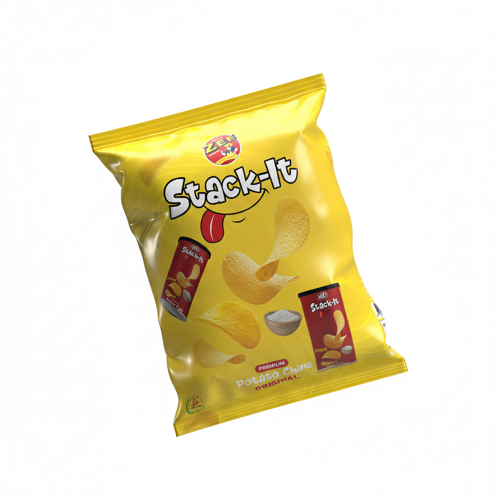
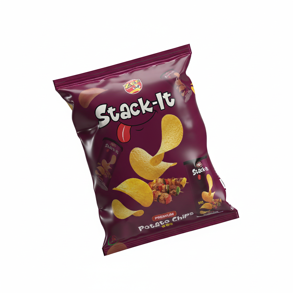
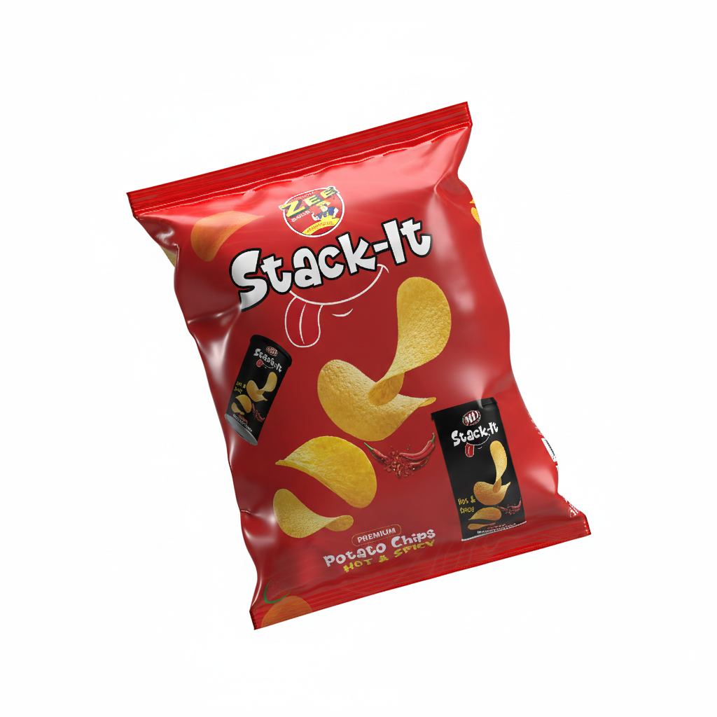
Stack-It is a premium snack brand focused on delivering bold flavors and a fun, engaging consumer experience. The objective was to create a vibrant packaging series for three core flavors—Original, Hot & Spicy, and BBQ—that stands out on crowded retail shelves while communicating the “stackable” nature and high quality of the product.
My Role
As the Integrated Graphic Designer, I was responsible for the complete visual development of the product line, including
Packaging Design:
Developing a cohesive color-coded system for flavor differentiation.
Brand Illustration:
Creating the iconic “Stack-It” typography and the playful “tongue” character element to evoke a sense of taste and enjoyment.
Product Visualization:
Designing the 3D mockups for both the flexible pouches and the secondary “canister” imagery featured on the packs.
Pre-Press Coordination:
Ensuring all design elements, color profiles, and ingredient layouts were optimized for high-quality rotogravure printing.
Key Design Features
Strategic Color Palette I utilized a high-contrast color strategy to ensure instant flavor recognition
Dynamic Composition The layout features “flying” chip assets to suggest crunch and lightness. By incorporating images of the canisters directly onto the bags, I bridged the gap between different packaging formats, reinforcing the “Stack-It” brand identity across the entire product family.
Appetite Appeal Each pack includes high-definition ingredient photography—such as sea salt, fresh chilies, and grilled skewers—to immediately communicate the flavor profile and stimulate consumer appetite.
The Results
The final designs resulted in a playful, energetic, and premium shelf presence. The unified design language across the three flavors provides the brand with a strong, scalable identity that can easily expand into new flavor categories in the future.