Skin White Twin Phase Make-up Remover – Product Development
Executive Summary
The Skin White Twin Phase Make-up Remover project involved the complete development of a specialized skincare line designed for all skin types. My role was to create a cohesive product experience—from the industrial design of the ergonomic bottle to the visual identity of three distinct variants (Aloe Vera, Rose, and Sea Minerals). The project required a deep understanding of product transparency, as the “twin-phase” nature of the liquid needed to remain a key visual feature of the final packaging.
Concept Ideation & Technical Sketching
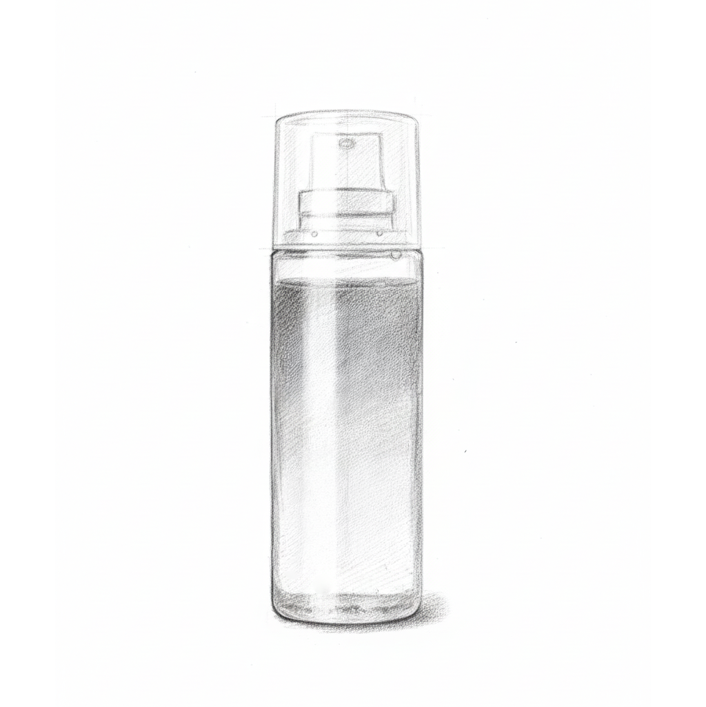
The design process began with a focus on functional elegance. Because make-up removers are often used with cotton pads, the bottle needed to be easily handled with one hand.
Symmetry and Balance: I sketched a cylindrical, minimalist form that emphasizes clarity and hygiene.
Dispensing Efficiency: The design includes a secure flip-top cap, engineered for controlled dispensing to prevent product waste.
Visual Transparency: I planned for a high-clarity material to ensure that the unique two-tone “twin-phase” liquid was visible to the consumer, serving as a primary aesthetic element.
3D Structural Modeling & Engineering
I transitioned the physical sketch into a 3D digital model to refine the proportions and ensure the bottle was ready for industrial manufacturing.
Precision Modeling:
The 3D wireframe allowed me to calibrate the exact wall thickness and base stability, ensuring the bottle stands firmly on vanity surfaces.
Volume Calibration:
I engineered the internal volume to match standard retail specifications while maintaining a slim, shelf-friendly profile
Manufacturing Blueprint:
This model served as the technical guide for the production team, ensuring that the physical mold remained true to the original design vision.
Brand Identity & Variant Differentiation
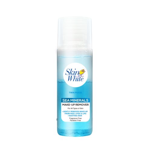
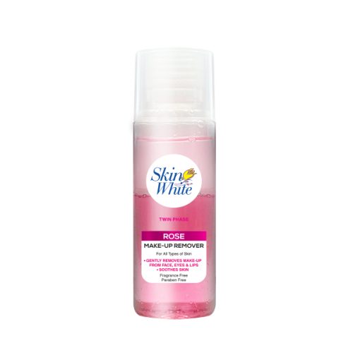
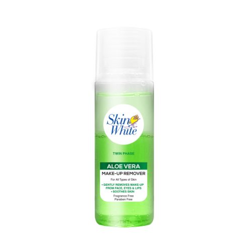
I developed a modular label system for three variants: Aloe Vera (Green), Rose (Pink), and Sea Minerals (Blue).
Twin-Phase Integration: I designed the labels with specific transparency zones to highlight the separation between the oil and water phases of the product.
Information Architecture: The layout prioritizes key USPs—”Fragrance Free,” “Paraben Free,” and “Soothes Skin”—using clean, modern typography to build consumer trust.
Color Strategy: Vibrant, variant-specific color bands at the base of the label provide instant shelf recognition while maintaining a unified “Skin White” brand family look.
Pre-Press & Print Management
A critical part of my responsibility was coordinating with the printing team to ensure the “Skin White” logo and variant colors translated perfectly onto the clear substrate.
Material Selection: I chose specialized, water-resistant label materials that maintain their adhesive integrity and color vibrancy in humid bathroom environments.
Color Accuracy: I managed the color-matching process to ensure the greens, pinks, and blues of the labels perfectly complemented the colored liquid phases of the product.
Marketing & Visual Launch
The project concluded with the design of a high-impact marketing poster for the official product launch.
Usage Visualization: I composed the visual to show the product in action, featuring a clean, lifestyle-focused aesthetic that emphasizes gentle and effective removal.
Value-Driven Design: The poster clearly communicates the product’s benefits, targeting all skin types and highlighting its use for face, eyes, and lips.
Key Achievements
End-to-End Product Lead: Successfully managed the transition from a 2D sketch to a 3D model and a finalized retail product.
Structural Innovation: Designed a custom bottle that balances ergonomic comfort with the technical requirements of twin-phase liquid storage.
Brand Expansion: Developed a scalable design system that allowed for three distinct variants to be launched simultaneously under a cohesive visual identity.