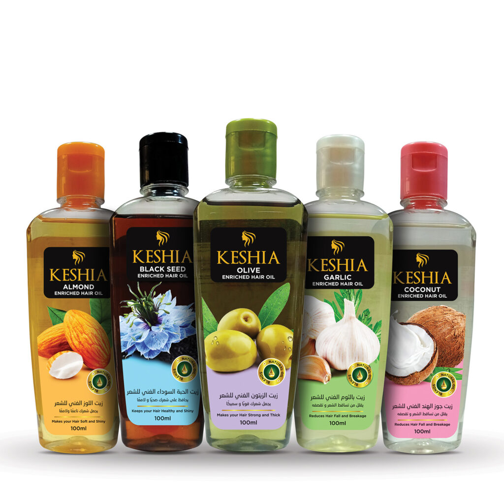
Keshia Enriched Hair Oil
Executive Summary
The Keshia Enriched Hair Oil project was an end-to-end design and production assignment focused on establishing a premium visual presence for a new 5-variant product line. My role encompassed the entire product development lifecycle: from the industrial design of the 3D bottle silhouette and bilingual label identity to technical print coordination and the final visual marketing assets. The result is a cohesive, shelf-ready brand family that balances ergonomic utility with high-impact aesthetics.
Concept Ideation & Structural Sketching
Every great product begins with a vision for its physical form. Before moving into digital rendering, I initiated the project with detailed Industrial Design sketching to establish the foundation.
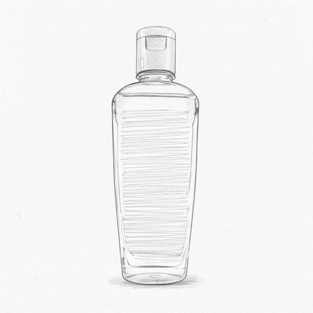
Ergonomic Blueprint: I focused on a tapered, flat-oval silhouette that fits naturally in the hand, ensuring ease of use in high-moisture environments.
Prototyping the Canvas: By planning the structural “face” of the bottle early, I ensured that the future branding would have a prominent surface to prevent distortion of typography and imagery.
Cap Integration: I explored the relationship between the flip-top closure and the bottle’s shoulders to create a seamless, unified premium look.
3D Structural Modeling & Engineering
Following the initial ideation, I transitioned the design into a digital environment to develop a high-precision 3D Structural Model.
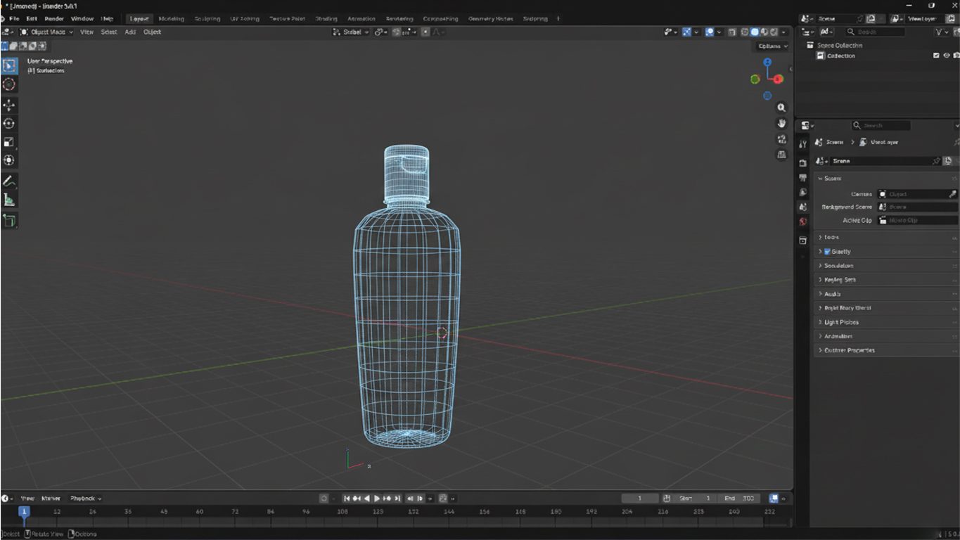
Precision Engineering:
I developed the wireframe to define the exact curvature and volume, ensuring the bottle holds a precise 100ml capacity while maintaining its sleek profile.
Prototyping for Manufacturing:
This 3D model served as the technical blueprint for production molds, allowing me to resolve potential manufacturing challenges like wall thickness and cap-fit tolerances.
Surface Optimization:
I perfectly calibrated the front and back “faces” to receive high-quality labels without wrinkling or air bubbles during high-speed application.
Brand Identity & Multi-Variant Labeling
Once the physical form was finalized, I developed a modular labeling system for five distinct variants: Almond, Black Seed, Olive, Garlic, and Coconut.
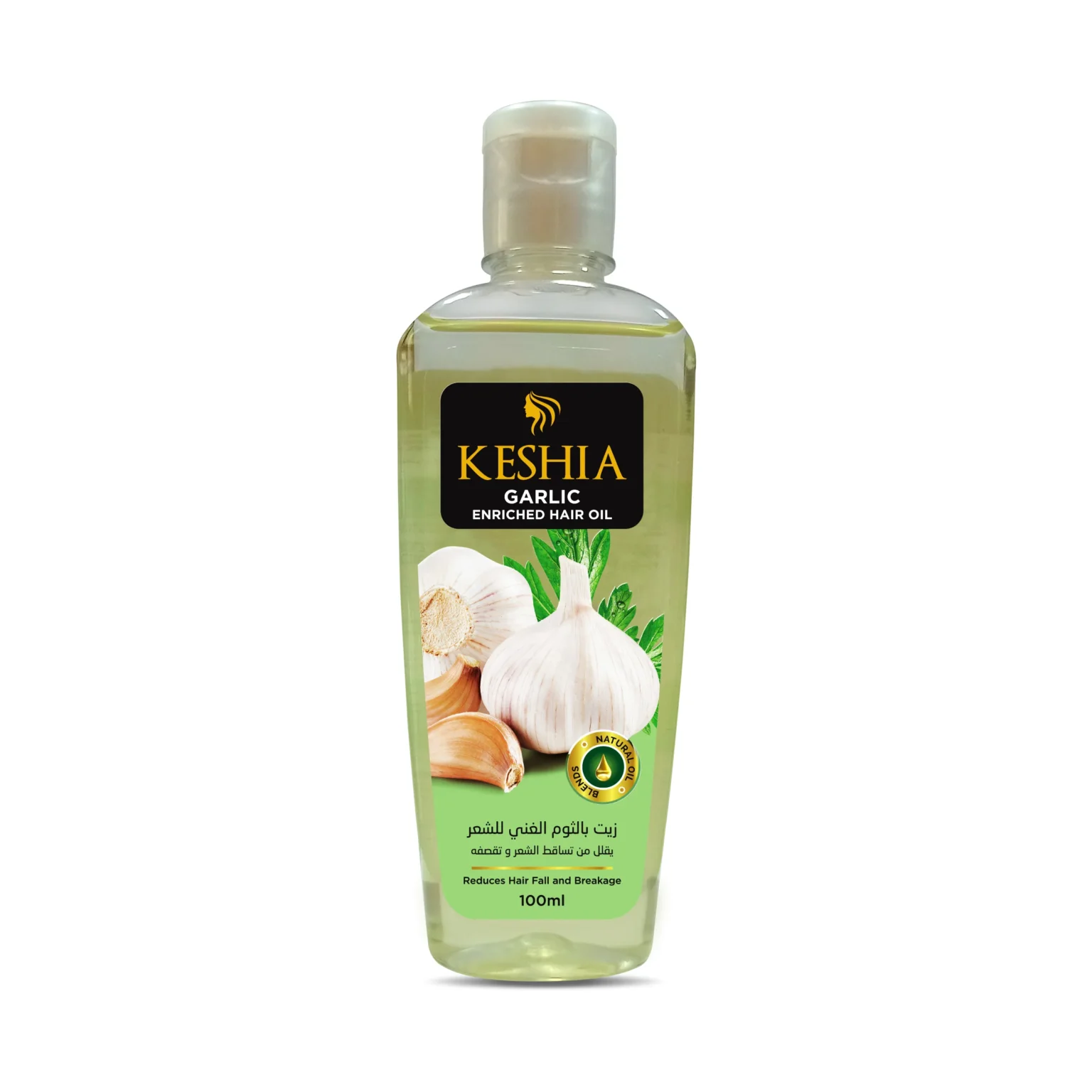
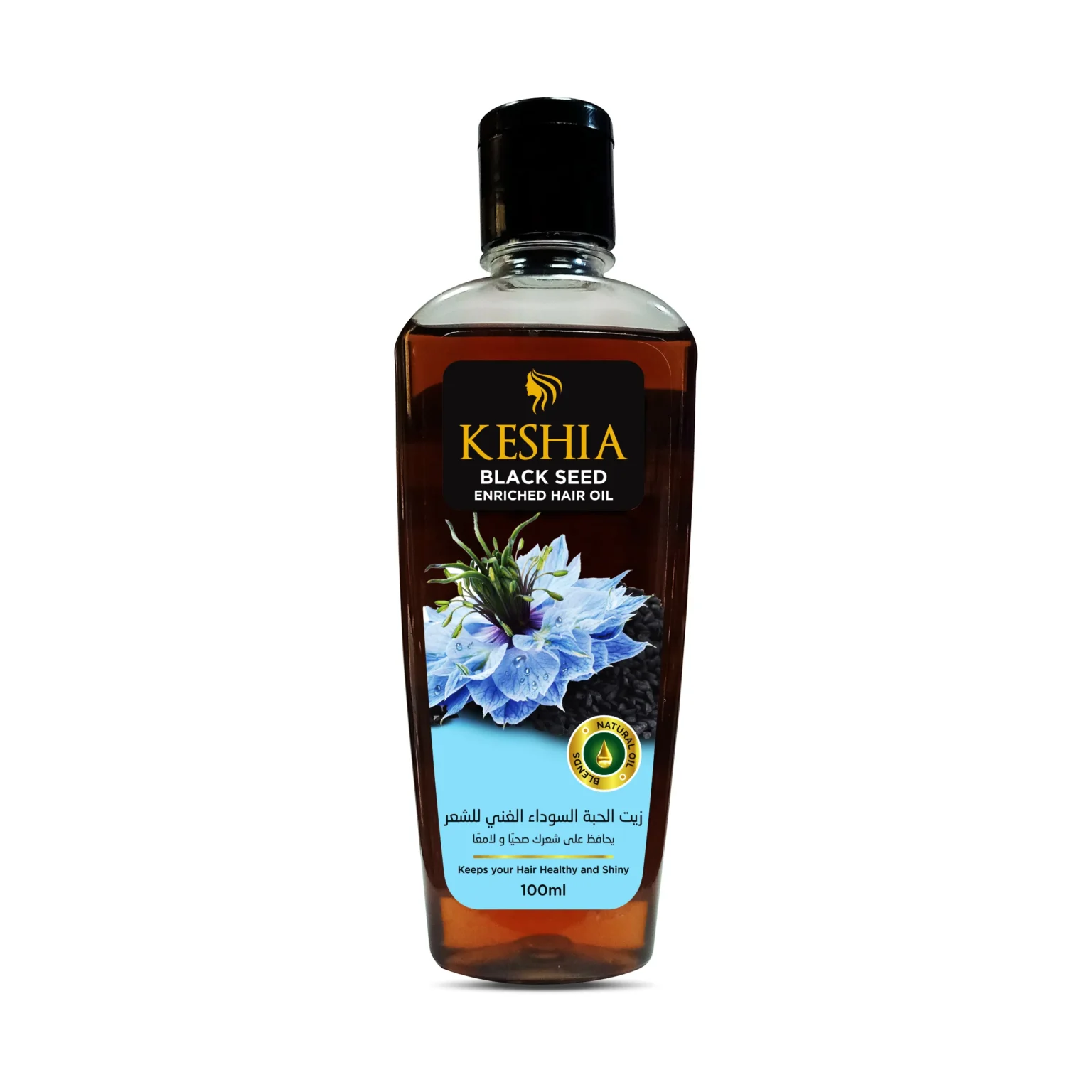
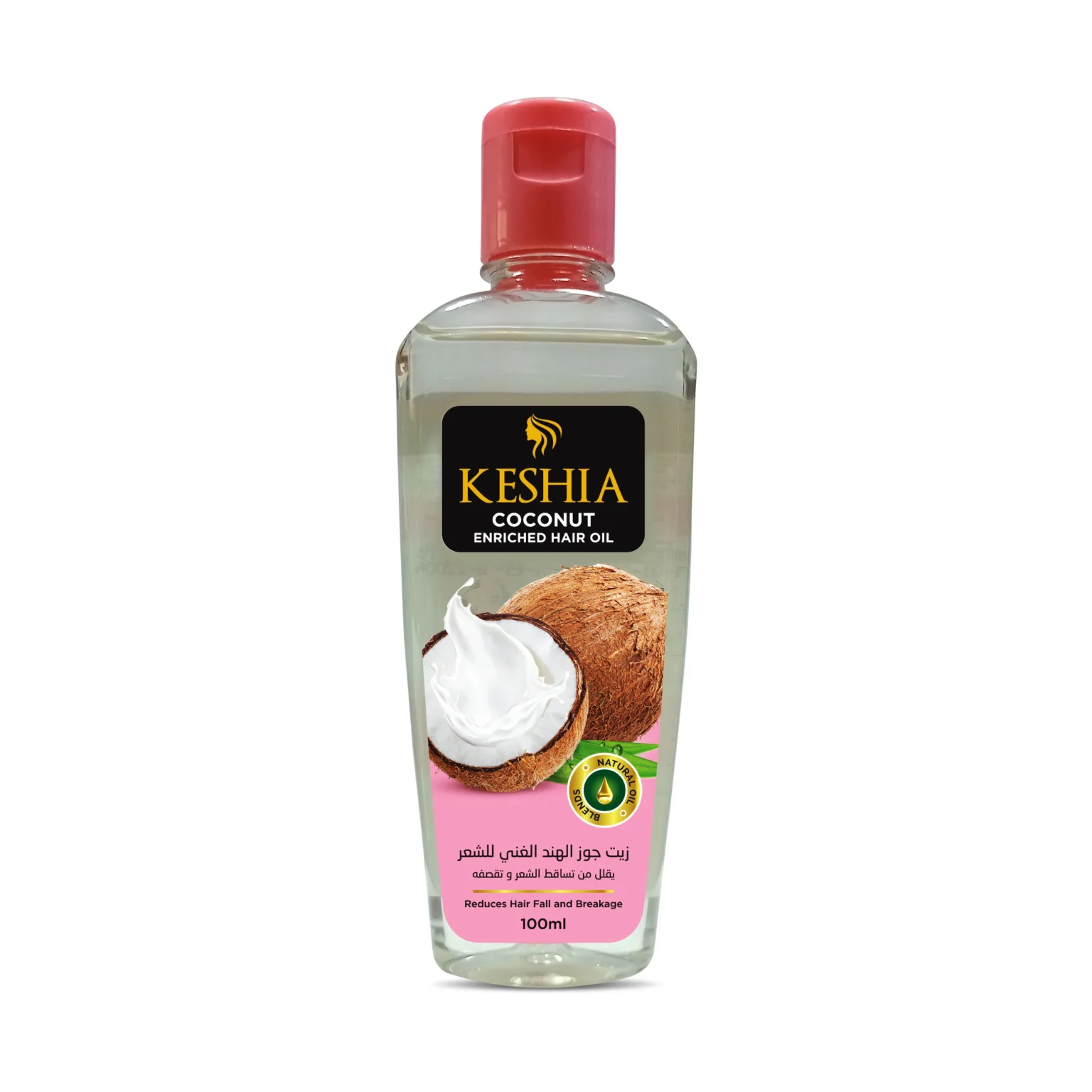
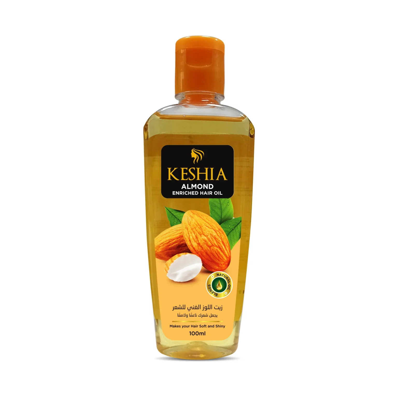
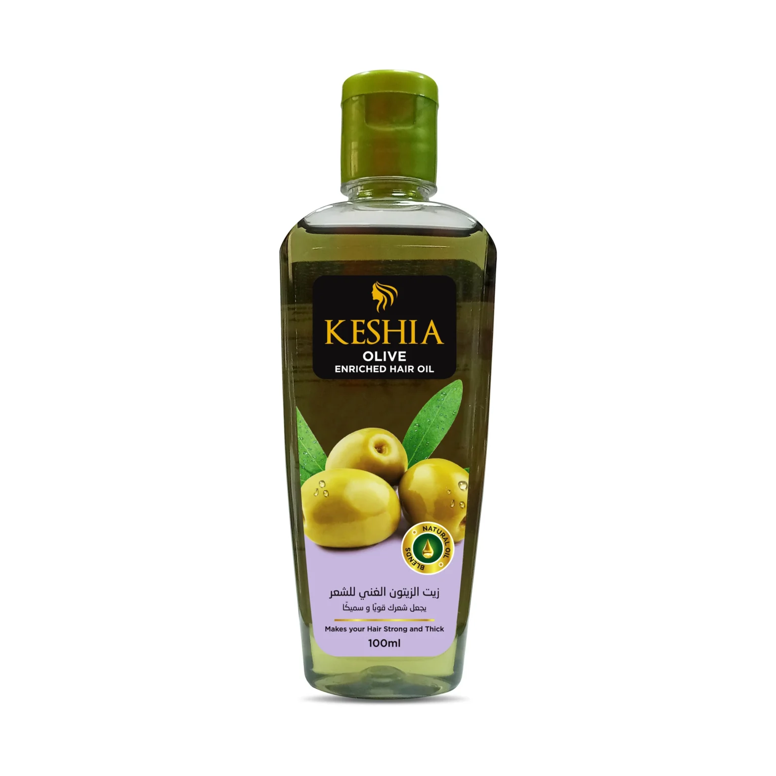
Visual Hierarchy: I utilized high-resolution ingredient imagery at the base of the labels to provide instant consumer recognition.
Bilingual Information Architecture: I crafted a clean, balanced layout that accommodates both English and Arabic typography without compromising the premium aesthetic.
Color Theory: I used specific cap colors and visual cues to distinguish between the five “flavors” while maintaining a unified “Keshia” brand family look.
Technical Pre-Press & Production Management
A critical component of my role was acting as the technical liaison with the printing department to ensure the digital vision became a physical reality.
Technical Oversight: I managed the “Press-Check” phase, overseeing color calibration, material selection, and finish quality
Material Integration: I selected specialized substrates that withstand oil contact while ensuring the labels remained vivid and clear against the various liquid tones of the oils.
The Final Launch Showcase
The project culminated in the creation of a sophisticated product showcase for the official launch. I managed the artistic direction and digital composition to emphasize the “Enriched” value proposition.
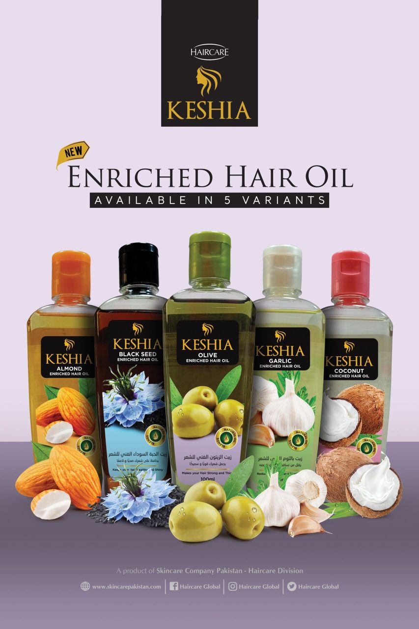
High-Fidelity Composition: I utilized 3D-style rendering and strategic lighting to create a “hero” image that serves as the definitive visual anchor for the brand.
Visual Storytelling: By arranging the bottles alongside their raw natural ingredients, I created a narrative of purity and quality that builds immediate consumer trust.
Key Achievements
End-to-End Delivery: Successfully transitioned a concept from a 2D sketch to a 3D physical bottle and a market-ready product line.
Optimized Production: Reduced manufacturing errors by coordinating directly with the printing team during the design phase.
Unified Brand Language: Established a cohesive design system that allowed five distinct variants to coexist under one strong brand identity.
Ready to Build
Your Visual Success?
Let's discuss how integrated design strategy can transform your brand's presence and drive measurable results.