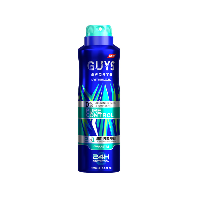
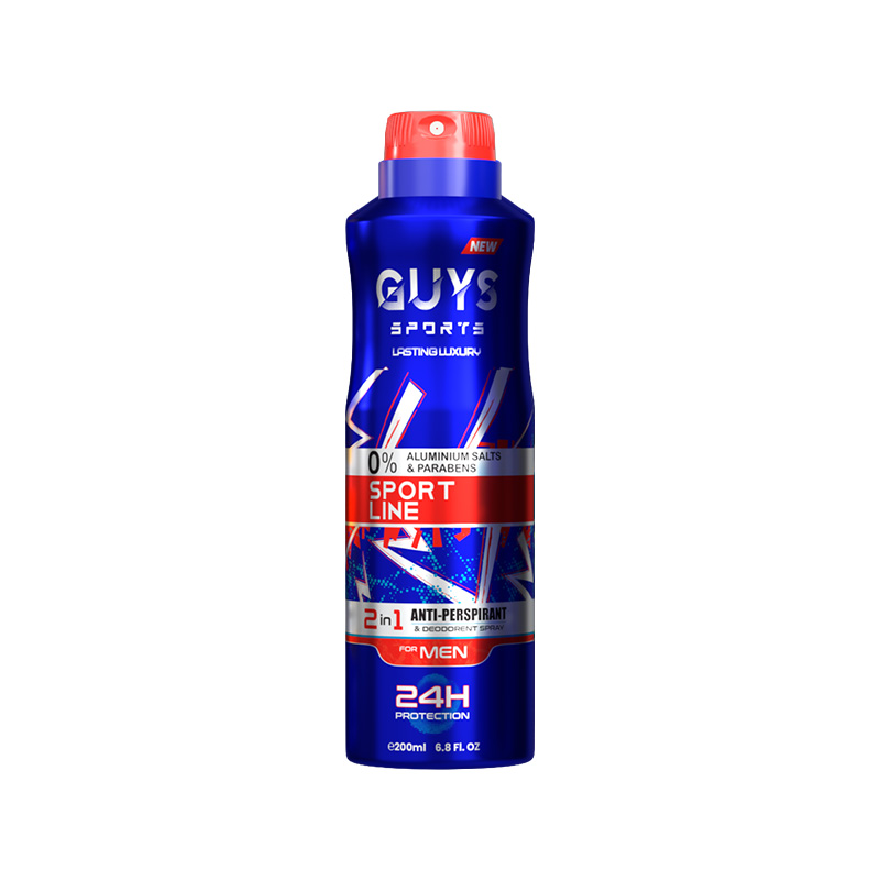
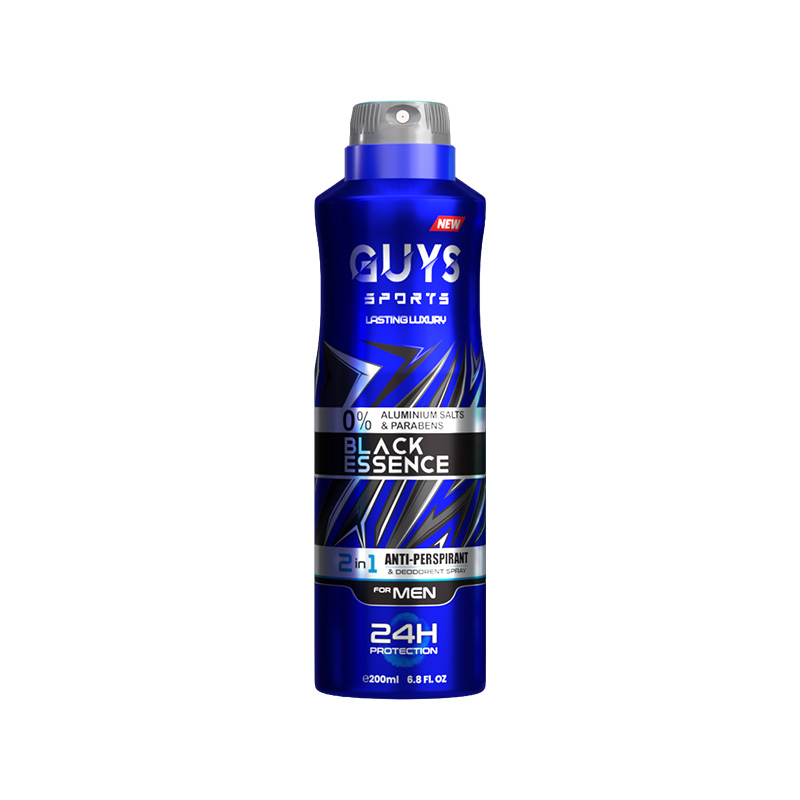
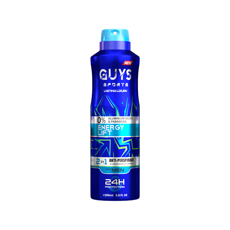
The Guys Sports Deodorant Spray project is a comprehensive case study in multi-variant product development. My objective was to design a high-performance grooming line that maintains a strong, cohesive brand identity while offering five distinct visual personalities. This project highlights a full production pipeline—from raw conceptual sketches and custom 3D modeling in Blender to final photorealistic rendering and prepress-ready artwork.
The Design Process
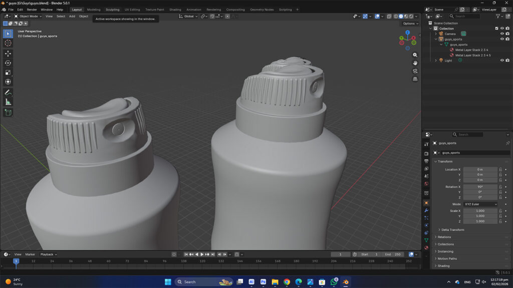
Conceptualization & Ergonomic Sketching
Every great product begins with a physical design phase. For this project, I focused on creating a “power-grip” silhouette tailored for an active demographic.
The Goal:
To move beyond generic “stock” can shapes and create a rugged, ergonomic form that feels secure in the hand.
The Result:
A custom-contoured can body with an integrated, low-profile spray cap.
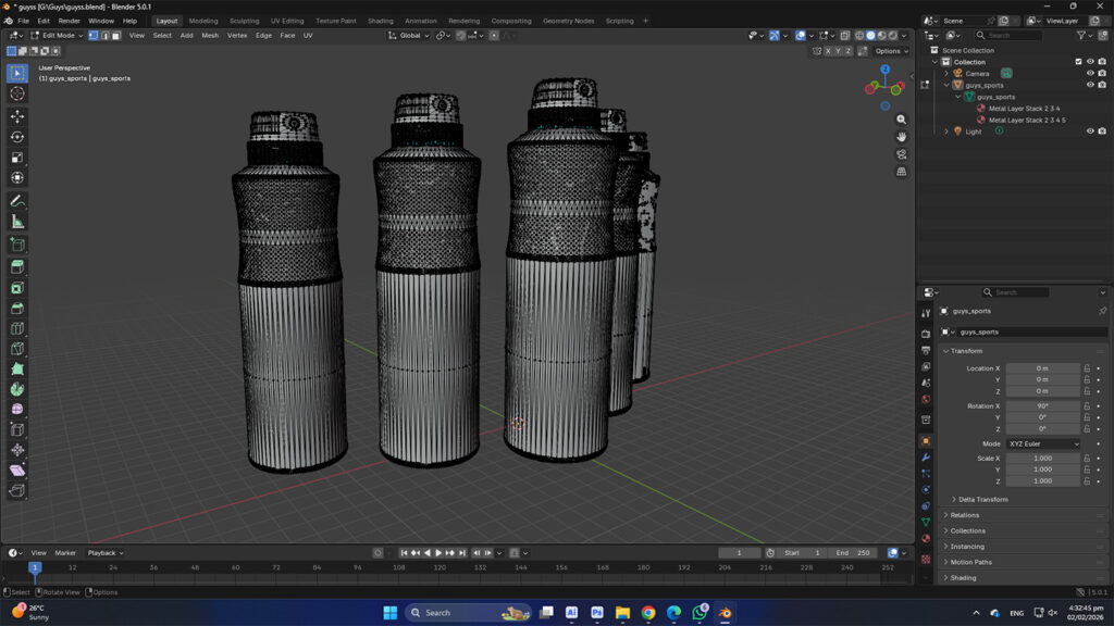
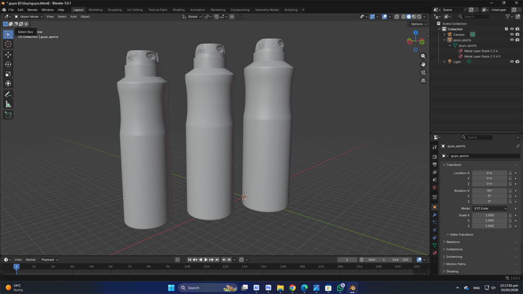
Custom 3D Modeling using Blender
With the sketches finalized, I transitioned into Blender to build the technical foundation of the deodorant spray.
High-Poly Mesh:
I modeled a custom 3D mesh from scratch to ensure a unique structural identity and smooth surfaces.
Technical Details:
Every component—the body, the gold-rimmed neck, and the nozzle—was modeled as a separate piece to allow for realistic material application.
UV Mapping:
I meticulously unwrapped the 3D model to ensure the artwork would wrap perfectly without distortion.
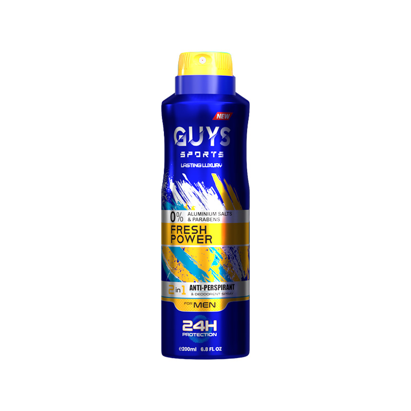
Multi-Variant Artwork Design
While building the 3D model, I developed the visual language for the entire range. I designed the Guys Sports logo and the “24H Protection” badges to act as consistent anchors across all products. I then created five distinct artworks:
Texturing & Photorealistic Rendering
The final stage involves bringing the 2D artwork and 3D model together in a digital studio environment.
Material Shaders
I applied a “Brushed Aluminum” shader to simulate the metallic feel of the can and a matte finish for the plastic caps.
Lighting Design
I used a studio lighting rig to create professional highlights and reflections that make the metallic colors and branding “pop.”
Final Range Presentation
To conclude the project, I presented the full lineup as a market-ready collection. This step demonstrates the ability to maintain strict brand consistency while scaling a product line across multiple variations.